2026
One choice, many futures
Otherwise starts with a pretty simple idea: one decision can lead to completely different outcomes depending on what happens next.
The identity came from that. Forms split, colors move into each other and compositions keep changing without losing their structure. The goal was to make uncertainty feel visual, while still keeping the brand clear enough for a serious B2B product.

Built from possibility
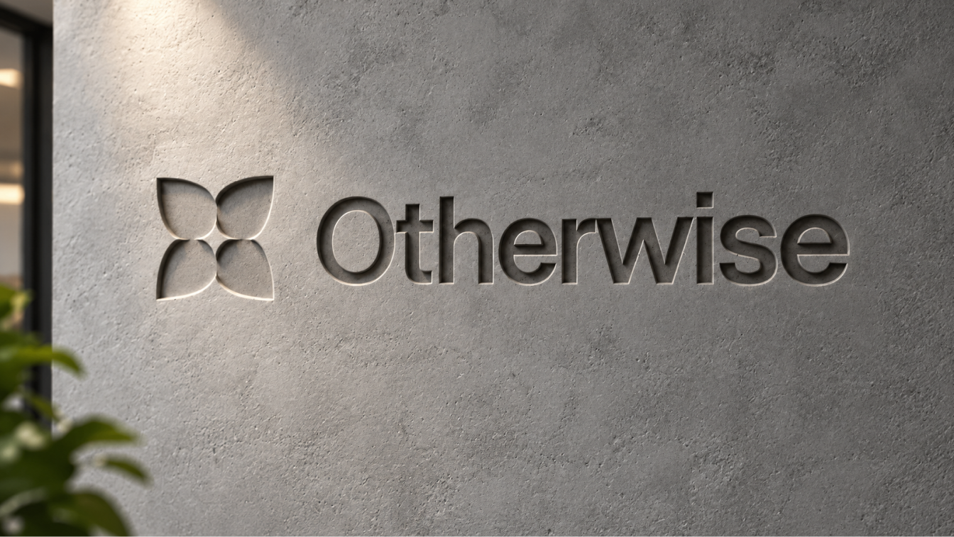
The mark is built from four forms meeting at the same point. They can be read as separate directions, but together they still create one complete shape.
That felt right for Otherwise. The product is about looking at different possible outcomes without losing sight of the decision that created them. We wanted the symbol to carry that idea without literally drawing a decision tree or turning it into an obvious tech icon.
4 forms
4 accent colors
Designed to shift
The visual system takes the same idea and pushes it further. Nothing really stays completely still. Gradients move, colors overlap, halftones break smooth surfaces apart and layouts can shift between something very expressive and something much quieter.
The serif brings a more editorial side to the identity, while the sans serif keeps the product and smaller information simple. That contrast became important. Otherwise needed enough personality to stand out, but it still had to feel like a tool people could actually trust with important decisions.
Turning the system digital
The website had to explain a product that is quite abstract without filling the page with explanation.
We kept the structure simple and let the identity do more of the work. Large editorial headlines introduce the ideas, while product moments underneath show what Otherwise actually does. The gradients and halftones carry the energy of the brand, but the layout stays restrained so the site never starts feeling like a campaign page for an AI tool.
Decision intelligence
Decisions, made visible
The product is built around decisions rather than dashboards for the sake of dashboards. A team can define a question, run simulations, compare possible outcomes and see how confidence changes as new information comes in.
The interface is intentionally much quieter than the brand work around it. Most of the product stays neutral, with color used when it actually means something: status, confidence, risk or an important insight.
That separation helped the product feel connected to the identity without forcing the full visual language into every screen.
The result
One identity. Every touchpoint
A distinctive brand, a clear website and a focused product interface, all connected by the same visual system. Expressive where it needs to stand out, restrained where people need to focus
Apostolos Ntziokas - Design Lead, Otherwise
“The team behind the project made a complex idea feel clear and distinctive. Every part of the identity feels connected, from the brand to the product.”
Created in collaboration with Frame Creative Group